There’s this weird tension happening at events lately. Everyone wants their celebration to look amazing in photos, but somewhere between the perfect tablescape and the color-coordinated everything, the actual party gets lost. Guests end up standing around in a beautiful space that feels more like a museum than a place where people want to relax and have fun.
The thing is, visual appeal and genuine enjoyment don’t have to be at odds with each other. The best events manage both, and it’s not because someone spent a fortune or has some secret planning gene. It comes down to making smarter choices about what actually matters.
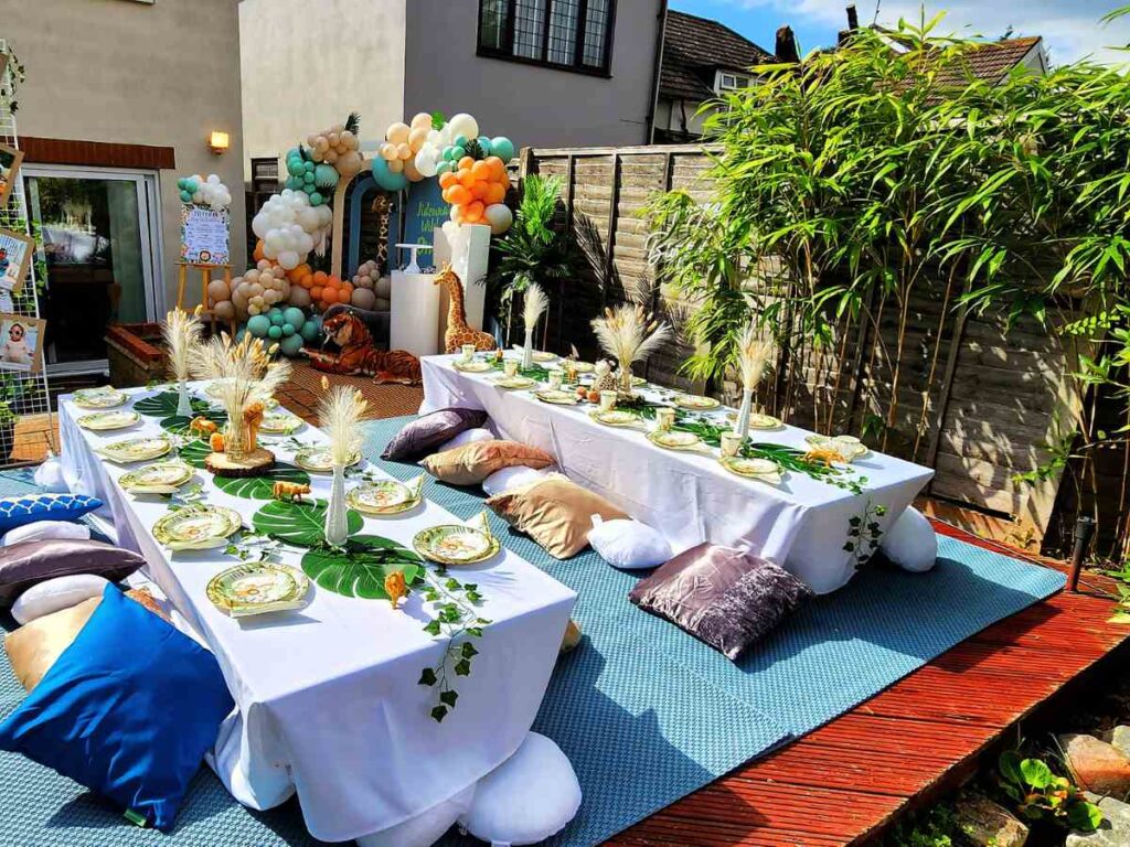
The Comfort Factor Nobody Talks About
Here’s what happens at most aesthetically-focused events: the chairs look incredible but become torture devices after 20 minutes. The cocktail tables are positioned perfectly for photos but create awkward clusters where half the guests can’t find anywhere to set down their drinks. Everything photographs beautifully, but people start leaving early because they’re uncomfortable.
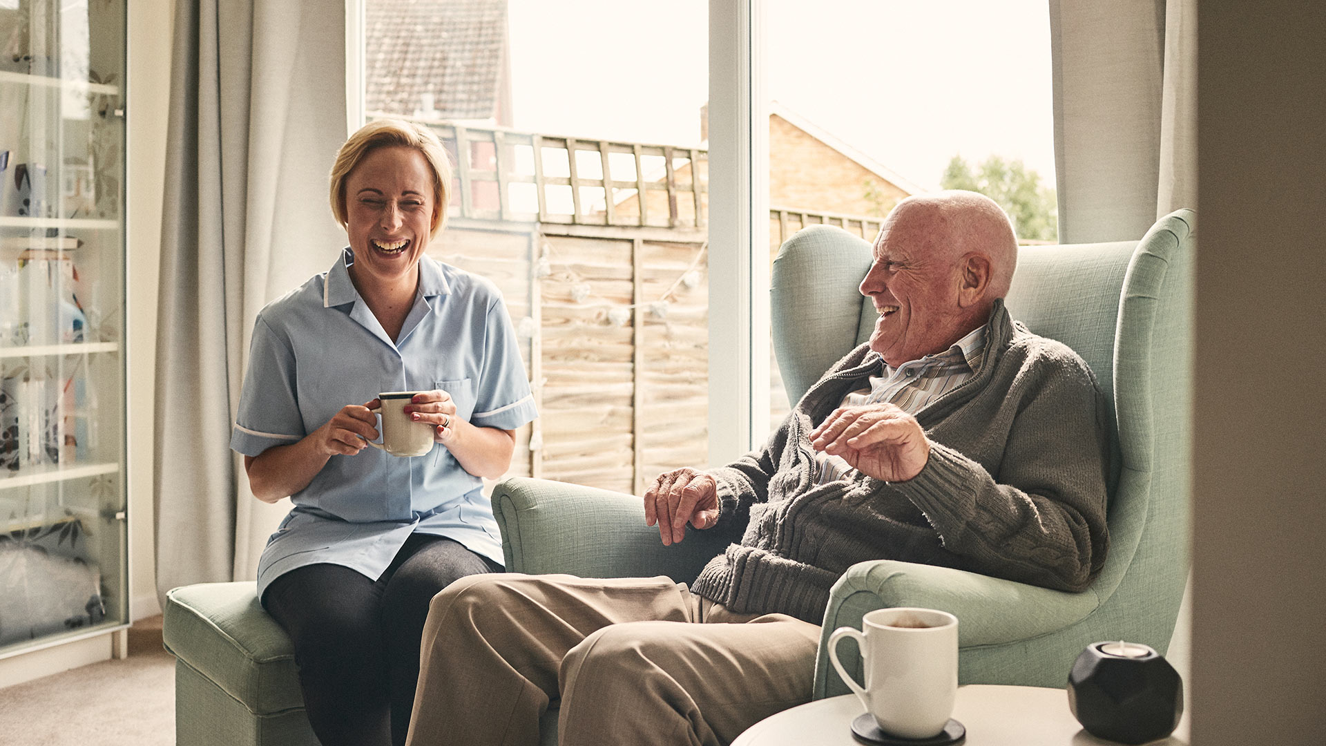
Comfort isn’t boring or basic—it’s what allows guests to actually stay and enjoy themselves long enough to create those organic, genuine moments that make the best photos anyway. When people are physically comfortable, they relax. They laugh more, they talk longer, they don’t spend the whole evening shifting their weight or looking for somewhere to sit down.
The solution starts with thinking about furniture as functional first, beautiful second. Quality rentals have figured this out already—pieces that look great but also support people through a full event. Companies specializing in Phoenix party rentals understand this balance and provide furniture that holds up visually and physically throughout the celebration, which makes a noticeable difference in how guests experience the event.
Lighting Changes Everything (But Most Hosts Get It Wrong)
Bad lighting kills more otherwise-great events than almost anything else. That gorgeous venue looks completely different at 7 PM than it did during the afternoon walkthrough, and suddenly all those carefully chosen colors look muddy or harsh.
The Instagram-worthy approach usually involves string lights everywhere, which can work but often creates flat, even illumination that doesn’t add depth or interest. Better lighting uses layers—ambient light for overall visibility, accent lighting to highlight specific areas, and something softer near seating areas where people gather.
This doesn’t require a professional lighting designer or a massive budget. Strategic placement of different light sources creates dimension. Uplighting behind furniture, candles at varying heights, and warmer bulbs in guest areas all contribute to a space that photographs well and feels inviting. The key is avoiding the temptation to light everything equally, which flattens the space and makes it feel more like a conference room than a celebration.
The Layout Problem That Ruins Guest Flow
Walking into a beautifully styled event that has nowhere to actually go is frustrating. The entrance area is packed, the bar has a line wrapped around the photo backdrop, and the seating area feels disconnected from where things are happening. Everything looks perfect in the planner’s layout sketch, but in practice, guests are constantly navigating around obstacles or getting stuck in dead zones.
Good flow isn’t accidental. It requires thinking about how people naturally move through spaces and what they need access to throughout the event. Bars and food stations need approach space from multiple angles. Seating areas should be near but not blocking main pathways. Photo opportunities work best when they’re slightly off the main flow, not creating bottlenecks.
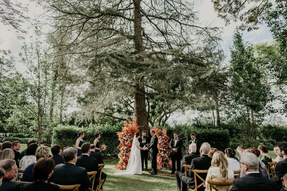
The visual-first approach often clusters all the beautiful elements together because it looks cohesive, but this creates crowding in some areas while leaving other parts of the venue empty. Spreading out the attractive elements encourages guests to explore the whole space and prevents congestion. It also creates more varied photo backgrounds naturally.
When Less Actually Looks Like More
The impulse to fill every surface with decor is strong, especially when scrolling through event inspiration online. But overlayered spaces photograph busy and feel overwhelming in person. Guests don’t know where to look, and ironically, individual elements get lost in the visual noise.
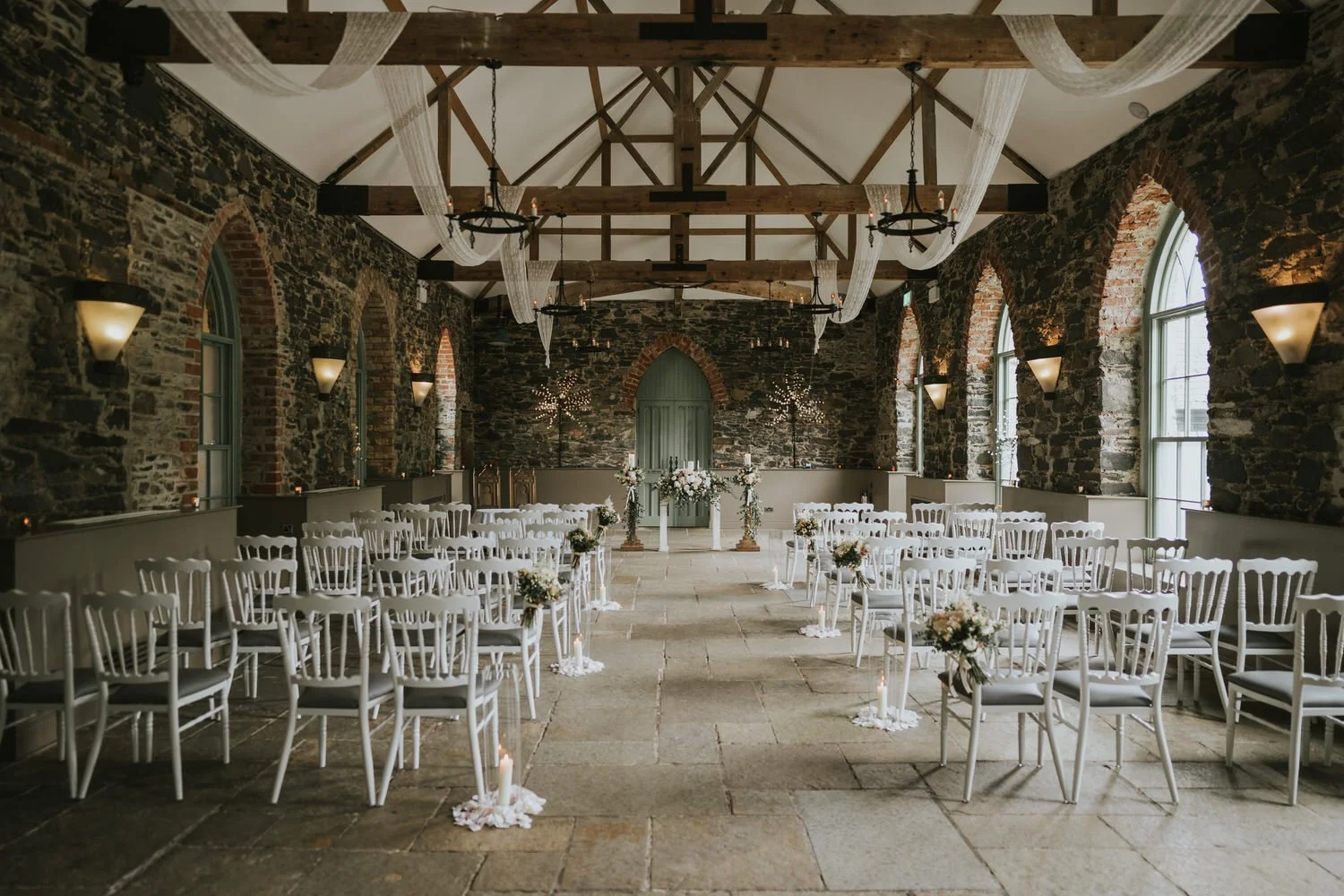
Restraint creates impact. A few statement pieces—a stunning furniture arrangement, one dramatic floral installation, interesting architectural lighting—stand out more than a dozen competing focal points. This approach also photographs better because there’s clear visual hierarchy rather than everything fighting for attention.
This strategy has practical benefits beyond aesthetics. Fewer decor elements mean easier setup, lower costs, and less time spent on styling details that guests barely notice. The money saved can go toward higher-quality core elements that actually affect the experience—better seating, improved catering, or professional setup help.
The Reality of Event Photos
Most event photos that look amazing online were taken during a specific window when lighting was optimal, before guests arrived and moved things around, or from carefully selected angles that hide the awkward parts. That’s not dishonest—it’s just how event photography works.
Trying to maintain that pristine, pre-guest perfection throughout an actual event creates stress for everyone. Hosts become anxious about moved chairs or slightly messy tables, guests feel like they can’t relax and enjoy themselves, and the atmosphere becomes stiff. The best events accept that things will get a bit disheveled, because that means people are actually using the space.
The better goal is creating a foundation strong enough that the event still looks good even after guests have been there for hours. Quality furniture that maintains its appearance, thoughtful color schemes that don’t show every spill, and layouts that still function when people rearrange things slightly—these choices support both visual appeal and genuine use.
Making Decisions That Support Both Goals
Every planning choice offers an opportunity to balance aesthetics with experience. Opting for cushioned seating over minimalist hard chairs. Choosing table heights that work for actual dining rather than just looking dramatic. Selecting decor that won’t topple over or require constant adjustment.
These decisions don’t compromise the visual result—they enhance it by creating scenes of actual enjoyment rather than staged perfection. Photos of guests genuinely laughing and engaged beat carefully posed shots in empty spaces every time, and they’re what people remember about events long after the decorations are packed away.
The events that succeed at both looking beautiful and feeling great share a common approach: they prioritize the guest experience in their planning, then make that experience look as good as possible. Not the other way around. When comfort, flow, and function come first, the aesthetic elements can be layered on in ways that enhance rather than detract from what matters most—people actually having a good time together.